on
WebDesign: The DIGITALHOME
After a long time a new article on my blog. It’s about a Design, which I crafted the last couple of days.
In the last couple of days I crafted a simple tile-Design for my design course at the university. It seems it returned some of my lost Mojo right back to me.
After the move from Darmstadt to Fulda I definitely had lost all of my Mojo. Good thing a friend of mine recommended me this nice Mojo soup.
Anyway, back to topic.
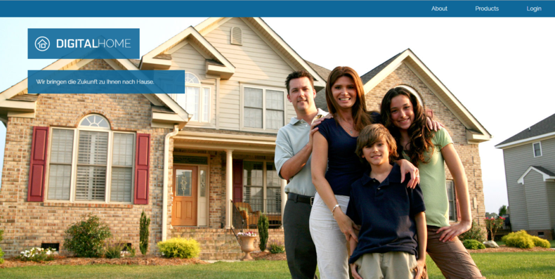
The idea behind this Design is a Company that helps people from middle class to achieve a fully digitized home. To put it another way they offer services for building up new homes with centralized computation or upgrades for exiting ones.
Together with two fellow students we crafted the idea and logo.
The Logo
As we started with the logo we decided that the digits “1” and “0” should be part of it as the company has to do with digitization. Not long and the first draft was crafted. The digits became part of the “home”.
The first draft of the logo. My creation.
After some optimization the second draft had been build and two fonts chosen.

The second draft. Created by a good friend.
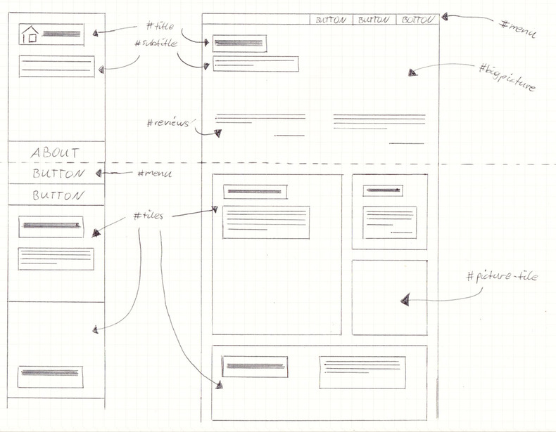
The Comprehensive Dummy
The first idea for the comprehensive dummy was to keep it simple and smoothly organized. I wanted to let it look like the front of a house.
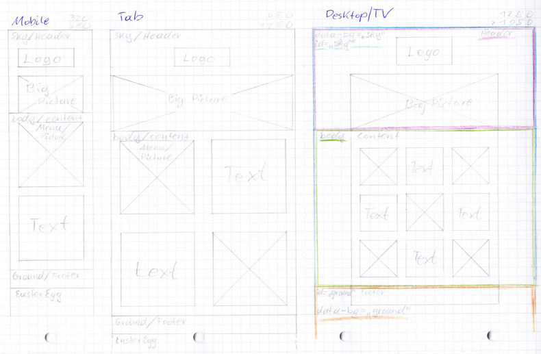
After some time I started to realize that this comp wasn’t what I expected and I started developing a new one. This time the focus laid on usability and trusted structure.
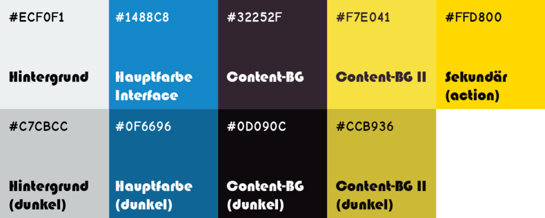
The Colours
As the main colours I fought about blue and black. Yellow as some sort of call to action.
The Implementation
The Code is build up with HTML5 and CSS3 in form of SASS. As preparation for development of this design I crafted a Adaptive Metro-Style-System on codepen.io.
See the Pen Adaptive Metro-System by w4tsn (@w4tsn) on CodePen.
// Imports
@import url(https://fonts.googleapis.com/css?family=Raleway:500);

// Variables
$color-tile-bg: #34495e;

$column-width: 15rem; // width of one tile-column
$column-margin: 2rem; // space between tiles

$bp-one: $column-width;
$bp-two: 2 * $column-width + $column-margin;
$bp-three: 3 * $column-width + 2 * $column-margin;
$bp-four: 4 * $column-width + 3 * $column-margin;
$bp-five: 5 * $column-width + 4 * $column-margin;

// Effective Code
body {
  margin: 0;
}

span {
  font-family: 'Raleway', sans-serif;
  font-weight: 500;
  text-transform: uppercase;
}

#content {
  width: 100%; // on mobile devices
  margin: auto; // center the content
  &:after {
    content: "";
    clear: both;
    display: block;
  }
  & .content-inner {
    margin-left: -$column-margin; // position-correction of the content
  }
}

[am-metro-box] {
  overflow: hidden;
  background-color: #95a5a6;
  width: 100%; // with this line and
  padding-bottom: 100%; // also this one the boxed layout is achieved
  position: relative;
  margin-bottom: $column-margin;
  margin-left: $column-margin;
  transition: all .3s linear; // make it all smooth
  float: left;
  & div {
      position: absolute;
      display: box; // fallback for older browsers
      display: flexbox; // fallback for IE10
      display: flex;
      align-items: center;
      justify-content: center;
      top: 0;
      left: 0;
      bottom: 0;
      right: 0;
  }
}

[am-metro-box]:hover {
  background-color: lighten(#95a5a6, 10%);
}

[am-metro-box~="blue"] {
  background-color: $color-tile-bg;
}

[am-metro-box~="blue"]:hover {
  background-color: lighten($color-tile-bg, 10%);
}

[am-metro-box] div span {
  color: white;
}

[am-metro-box~="blue"] div span {
  color: darken(#FFFFFF, 5%);
}

@media (min-width: $bp-two) {
  #content {
    width: $bp-two;
  }

  [am-metro-box] {
    width: $column-width;
    padding-bottom: $column-width;
  }

  [am-metro-box~="row=2"] {
    padding-bottom: 2 * $column-width + $column-margin;
  }

  [am-metro-box~="col=2"] {
    width: 2 * $column-width + $column-margin;
  }

  [am-metro-box~="col=3"] {
    width: 3 * $column-width + 2 * $column-margin;
  }

  [am-metro-box~="col=4"] {
    width: 4 * $column-width + 3 * $column-margin;
  }
}

@media (min-width: $bp-three) {
  #content {
    width: $bp-three;
  }
}
I started mobile first and added view-ports till it looked just right. SCSS helped with variables and at some point I will definitely add loops to generate some repeating code which is needed for the system to work.
Additional techniques that I used are CSS3 flexbox for centring the content of the tiles and the Adaptive-Design-Principle with fixed instead of fluid tiles, because the fluid ones are causing a rendering bug on most browsers. This is an algorithmic problem and doesn’t seem to be fixed right now.
If you want an example of that bug just check out this earlier version of my tile-system on codepen.io. Just re-size your browser window and you should see “it” happen.
See the Pen Metro Fluid Float by w4tsn (@w4tsn) on CodePen.
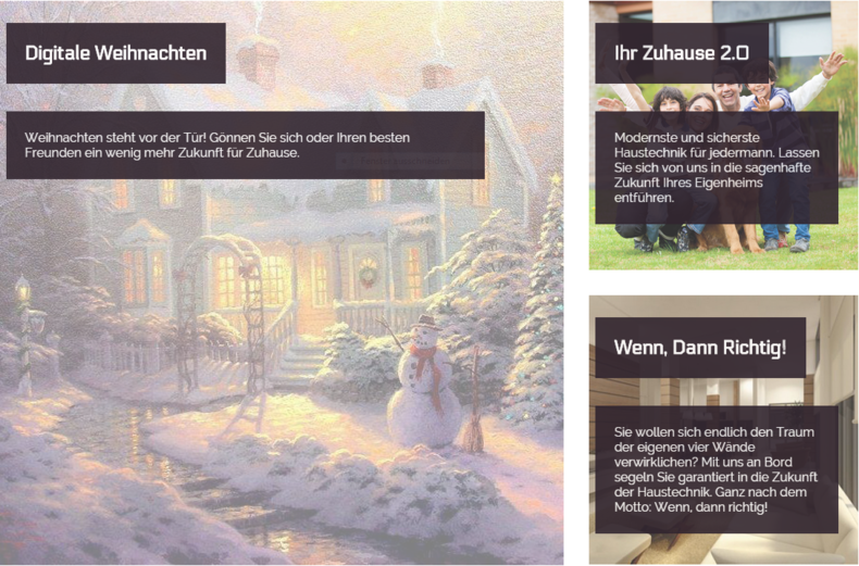
The Result
Finally
This project was really great fun and taught me a lot new things in all areas of web-design and -development.
What do you think of this simple first impression of this design? Do you have any advice or comment? Post it! ;)
Any thoughts of your own?
Feel free to raise a discussion with me on Mastodon or drop me an email.